


I would like to find a graph that goes back farther but this is the only one I can find right now.
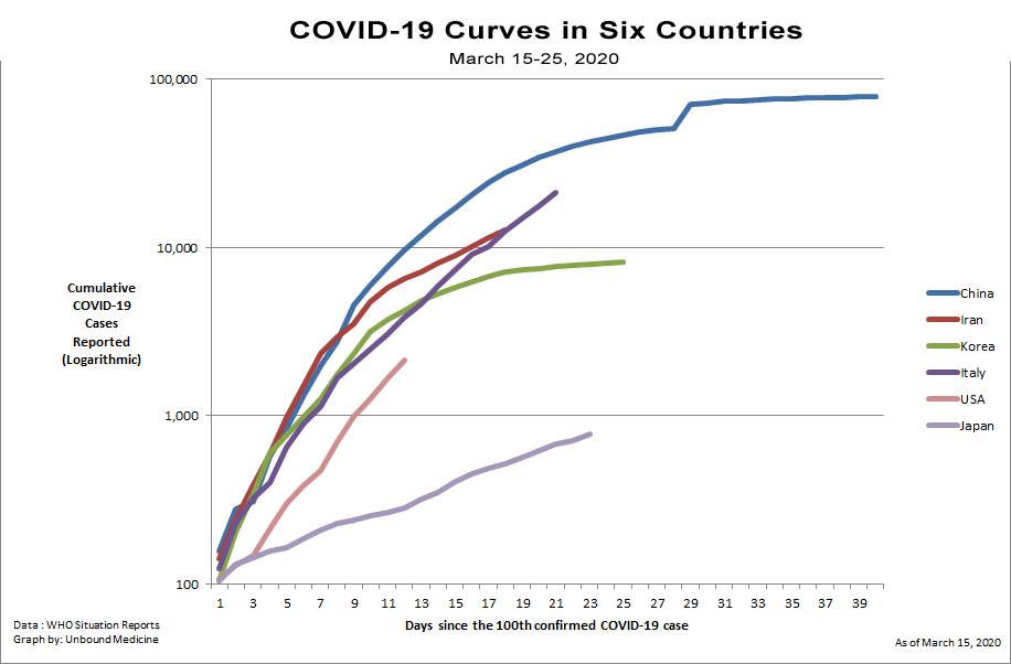
This chart essentially means nothing unless you can provide that all the countries on the graph had equal testing protocols and coverage. Given some of the names on there, I know the answer to that question.